In this article
Key Takeaways
- Screen RGB is not print CMYK: monitors emit light, while printers use inks on a surface, so ink set, material, output profile and lighting all affect the result; proof colors on the actual material.
- Rich black has no universal recipe: ask for the production workflow and ink limit for your printer, ink, substrate and profile; a fixed C40 M30 Y30 K100 build is not guaranteed to work.
- Do not use a fixed cyan-to-magenta formula to stop blue shifting toward purple; use the intended output profile and proof that blue on the material.
- For brand colors, give the exact Pantone Solid Coated code, such as PMS 186 C or PMS 286 C, with any approved tolerance; it sets the target but does not guarantee an exact match in process inks on every material.
- Backlit graphics need a dedicated profile, material and ink density: unlit and illuminated views differ, so evaluate a sample with the intended light source when day-and-night appearance is critical.
RGB vs. CMYK printing questions usually start with a familiar problem: the color on the screen looks different from the finished sign. Understanding the output process helps you prepare artwork and ask for the right proof before production.
Quick Answer: 3 Color Checks Before You Print
- Ask for the production workflow before building a large black background. A rich black combines black with other process inks, but the suitable recipe and total ink limit depend on the printer, ink, substrate and profile. A fixed C40 M30 Y30 K100 recipe is not a universal guarantee.
- Do not rely on a fixed cyan-to-magenta formula to prevent blue from shifting toward purple. Use the intended output profile and a proof on the actual material when the color is important.
- Provide the exact Pantone reference from your brand guide when color matching matters. It gives the print team a target; it does not guarantee that every spot color can be reproduced exactly with process inks on every material.
1. RGB vs. CMYK Printing: Why Screen Colors Shift
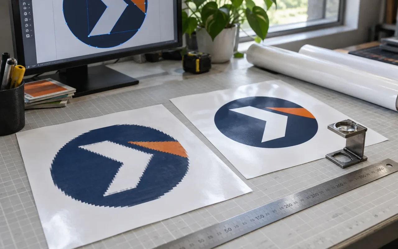
Monitors emit RGB light, while sign-printing systems reproduce color with inks on a particular surface. The printer’s ink set, the material, the output profile and the lighting all influence the result. Preparing the file in the requested color space is useful, but color conversion alone cannot make a reflective print reproduce every luminous screen color. Here is how to handle three common traps without relying on a one-size-fits-all ink recipe:
| Color Trap | What Can Cause It | A Better Production Check |
|---|---|---|
| Weak-looking black backgrounds | The ink combination, media and profile may produce a lighter black than expected. | Ask which rich-black build and ink limit suit the output. Keep fine text appropriate to the process; do not automatically apply a multi-ink background recipe to small type. |
| Blue shifts toward purple | The source color, profile conversion and achievable printer gamut can shift the hue. | Use the intended output profile and proof the specific blue on the material. Reducing magenta is not a universal fix. |
| Yellow or gold looks muddy | Ink combinations and substrate color can dull a bright intended color. Metallic gold also cannot be reproduced simply by choosing a process-CMYK formula. | Specify the target appearance, compare a proof and ask whether a specialty material or print process is needed. |
2. Why Backlit Graphics Need a Dedicated Print Profile
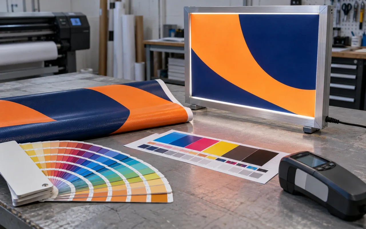
A graphic designed for front-lit viewing can look weak when strong light passes through it. A backlit print needs a suitable translucent material, an appropriate ink density and a profile developed for that process. The unlit and illuminated appearances are different viewing conditions, so both should be considered during proofing.
At SignCrisp, we select the backlit production method for the specified material and lighting system. Depending on the process, that can involve a dedicated higher-density profile, multiple print passes or a suitable layered UV construction. “Double-strike” is not a universal setting for every fabric and acrylic job. If day-and-night color appearance is critical, ask us to evaluate a sample with the intended light source before the full run.
3. How to Request Pantone (PMS) Color Matching
If your corporate brand book specifies Pantone Solid Coated codes, such as PMS 186 C or PMS 286 C, include the exact code and any approved tolerance in your order notes. Our team will confirm the closest achievable result for the selected ink and material. For demanding brand work, request a physical proof and agree on the viewing conditions; monitor previews are not a guarantee of the finished color. Have questions? Check our FAQ Page or Artwork Guidelines.